If anyone ever wondered what it is I do, I make maps. I make maps within the transportation planning department of an engineering/architecture firm. Most of the maps I make are for public involvement meetings where the client (usually a DOT) unveils a proposed design to fix some transportation issue. If the map and graphics I make are not associated with a public involvement meeting in some way, shape, or form, it typically has to go in some report or document for the client and/or interested parties for whatever project it is.
The documents where we are allowed to actually put some real effort into the aesthetic of the maps we produce (I supervise 2 cartographers as well) are the proposals that we ship off to prospective clients. It is on these pieces that we truly try to differentiate ourselves from our competition. These maps are more marketing pieces than traditional cartography. They are intended to be informational while still having a certain level of “eye candy” appeal to them. These are the products where we try to push the color palette. These maps are typically more enjoyable to make. They are more exploratory, because we have not fixed anything about their presentation as of yet. They are transient because we may not get the job we are going after. All in all, they just tend to be more interesting.
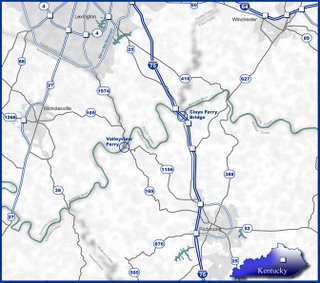
Today was the completion of one such map. This map is to be included in some way, shape, or form in a the interior or the cover of a proposal for a job in central Kentucky, just south of Lexington. The graphic designer who is assembling all of the other graphics associated with this proposal (he oftentimes posts here anonymously) and I decided to go with a more granite/marble color scheme for the project hovering around white, with deep blues and sea green for the details.
I am pleasantly surprised with how the final version came out. (I am not entirely sure how well Blogger will let you view the image. The original image is about 8” 8” (20.32 cm x 20.32 cm) in size. At that size everything is nice and legible. If you cannot see detail associated with the map, I apologize, but, really… It is all Blogger’s fault)
So, that, in case all 2 of you were wondering, is one of my tasks as a modern day cartographer.
To Recap:
Weekend was pleasantly boring
Tomorrow I will be out of the office, but still publishing my 4th weekly installment of 20 Questions
The color palette and style are attempting to give a sense of history within the context of current day modernity
I aced Introductory Art Appreciation and Art Histories I & II in college
Being able to write crap like “The color palette and style are attempting to give a sense of history within the context of current day modernity” is a direct result of those classes
I wish I could say that there was something in my daily repertoire that I use from my theory of Calculus classes Introduction to Analysis I & II
I got nada from those classes
Not a darn thing
The documents where we are allowed to actually put some real effort into the aesthetic of the maps we produce (I supervise 2 cartographers as well) are the proposals that we ship off to prospective clients. It is on these pieces that we truly try to differentiate ourselves from our competition. These maps are more marketing pieces than traditional cartography. They are intended to be informational while still having a certain level of “eye candy” appeal to them. These are the products where we try to push the color palette. These maps are typically more enjoyable to make. They are more exploratory, because we have not fixed anything about their presentation as of yet. They are transient because we may not get the job we are going after. All in all, they just tend to be more interesting.
Today was the completion of one such map. This map is to be included in some way, shape, or form in a the interior or the cover of a proposal for a job in central Kentucky, just south of Lexington. The graphic designer who is assembling all of the other graphics associated with this proposal (he oftentimes posts here anonymously) and I decided to go with a more granite/marble color scheme for the project hovering around white, with deep blues and sea green for the details.
I am pleasantly surprised with how the final version came out. (I am not entirely sure how well Blogger will let you view the image. The original image is about 8” 8” (20.32 cm x 20.32 cm) in size. At that size everything is nice and legible. If you cannot see detail associated with the map, I apologize, but, really… It is all Blogger’s fault)
So, that, in case all 2 of you were wondering, is one of my tasks as a modern day cartographer.
To Recap:
Weekend was pleasantly boring
Tomorrow I will be out of the office, but still publishing my 4th weekly installment of 20 Questions
The color palette and style are attempting to give a sense of history within the context of current day modernity
I aced Introductory Art Appreciation and Art Histories I & II in college
Being able to write crap like “The color palette and style are attempting to give a sense of history within the context of current day modernity” is a direct result of those classes
I wish I could say that there was something in my daily repertoire that I use from my theory of Calculus classes Introduction to Analysis I & II
I got nada from those classes
Not a darn thing